
Choosing a Color Block Ballet Leotard: Palette, Panel Placement and Fit
A color block ballet leotard works when its colors and panel boundaries support a clear design. Start with the main body color, decide where you want contrast, and check the result on a finished garment. A combination that looks balanced as small swatches can feel quite different when one color occupies most of the torso.
For a school or retail buyer, the practical question is how much contrast the intended setting allows. A subtle two-tone style can sit close to a plain training garment; a bright band or textured panel makes a stronger visual statement. Neither is automatically better. Choose the effect deliberately, then assess the garment’s fit and construction.
Build the palette around one main color
Choose the dominant body color first, then assign the other colors a role. One may define the upper bodice, another may form a band, and a smaller accent may follow the neckline or straps. This gives each color a purpose instead of making every part of the garment compete for attention.
For a quieter result, start by comparing neighboring shades with a restrained trim. For a more graphic result, compare a stronger difference between the main panels. These are design directions to evaluate, not rules that guarantee a particular appearance on every wearer.
Jinwu’s Color Block Ballet Leotard provides a concrete reference. The published design uses a V-neck, slim camisole straps and contrasting panels. The green version shown on the product page places a lighter upper section above a darker body, with a pale band and trim separating the areas.
The gallery also shows other combinations. Treat those images as references for the layout and visual effect, then confirm which colors and finishes are available for the proposed order. A gallery photograph does not establish current stock or every possible customization.
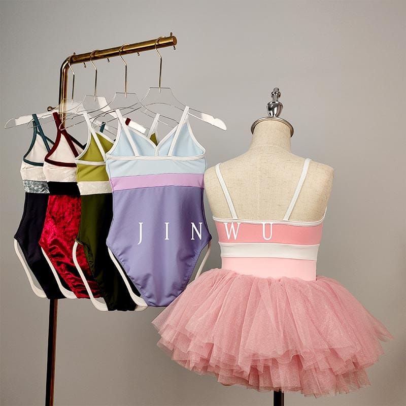
When comparing palettes for a collection, hold the layout constant at first. If the colors, band width and neckline all change together, it becomes difficult to identify which decision improved the design. Once the color direction is clear, refine the panel proportions.
Read the boundaries on the wearer
Look at where each boundary falls relative to the neckline, torso and waist. A contrast band creates a visible horizontal line; narrow trim defines an edge. The position and width of those features matter as much as the color itself.
For a V-neck ballet leotard, ask whether the trim follows the neckline cleanly and whether any central detail aligns as intended. Check the design from a normal viewing distance before examining the sewing closely. Both the overall arrangement and the finish need to work.
Do not describe a panel layout as universally slimming or flattering. Wearers have different proportions and preferences, and a photographed effect is not a guaranteed result. Show the design clearly and let fitting observations guide decisions about band position, neckline depth and torso length.
Check the back as well as the front. A band may continue around the garment, change width or meet another panel at the side seam. Ask the supplier to show the full layout so a front-view approval does not leave the back open to interpretation.
During fitting, have the wearer raise and lower the arms and move through class-appropriate positions. Notice whether a band remains in its intended place or pulls unevenly. A decorative line should not be mistaken for a fitted waist measurement or a support feature unless the construction actually provides that function.
If the leotard will be offered across a broad size range, review the panel proportions on representative sizes. A design approved on one sample may need further assessment before the same visual balance can be assumed throughout the range.
The panels must work together as fabrics
Color blocking can use different colors of one fabric or combine materials with different surfaces. Establish which approach the sample uses. A contrast that looks like a change of color may also involve a change in texture, stretch or thickness.
Jinwu’s product page lists 75% polyamide and 25% spandex for the Color Block Ballet Leotard. Confirm the composition and finish of each selected panel when discussing a specific variation. Do not transfer that single specification to every textured or styled garment visible in the gallery without confirmation.
Compare the fabrics joined together. Look at the band and side seams while the garment is worn: do they sit smoothly, or does one material hold back an adjacent section? A pleasing combination on the table still needs to move as a complete leotard.
| Design choice | What it changes visually | What to check on the sample |
|---|---|---|
| Two shades of one fabric | Emphasizes panel shape with a related surface appearance | Actual shade relationship and seam alignment |
| Contrasting band | Creates a clear horizontal break | Band position, width and comfort in movement |
| Contrasting neckline trim | Defines the neckline and strap edges | Even finish, intended line and comfortable openings |
| Textured and smooth sections | Adds surface contrast as well as color contrast | Material identity, joined movement and care compatibility |
| Light panel next to dark fabric | Makes the boundary more noticeable | Coverage, clean joins and color-transfer behavior under the agreed care routine |
Consider lining as part of that combination. A pale upper panel may need a different coverage assessment from the dark lower body. If lining is added, check whether its edge shows through or changes the appearance of the pale section.
A dancewear fabric guide can help structure the material comparison. For this design, concentrate on the relationship between adjacent panels rather than choosing each fabric in isolation.
Approve the colors on the fabrics being used
Use physical fabric references for the main panels and trim. Screens are useful for discussing a direction, but they are not a reliable substitute for approving the final color combination. Keep each reference identified so the supplier knows which material and panel it belongs to.
Compare the materials together under agreed viewing conditions. The aim may be tonal coordination or deliberate contrast rather than an exact match. State which relationship you expect before asking the supplier to judge whether the colors are acceptable.
Where formal color comparison is needed, AATCC EP9-2025 describes visual assessment of textile color difference against a standard. Agree on the assessment and acceptance criteria for the project; the procedure does not prescribe one universal tolerance for a color-block design.
Check the assembled sample after its proposed care routine, especially where light and dark sections meet. Color agreement at approval and resistance to transfer during care are different questions. If staining or bleeding occurs, record the affected area and care conditions before deciding what needs to change.
For that specific problem, use the guide to leotard colors bleeding during care. Do not rely on an improvised household treatment to make an unsuitable fabric combination acceptable for production.
Consider the school and the rest of the outfit
Confirm whether a school permits contrasting panels, trim and decorative finishes. A uniform rule that names one color may refer to a plain garment rather than a design that includes that color among several others. Have the teacher review the exact proposed combination.
For a camisole ballet leotard worn with a skirt, compare the full outfit. The skirt may cover the lower panel or interrupt a band that was central to the design. Choose whether the skirt should repeat one panel color, coordinate tonally or provide an intentional contrast.
The gallery photographs show some leotards styled with skirts. Those images illustrate outfit possibilities; they do not confirm that a skirt is included with every leotard order. Ask for the component list before describing the product as a set.
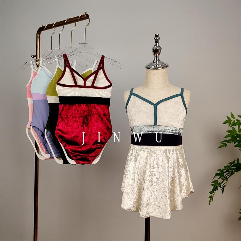
A retailer can make these distinctions clear through the product photographs. Show the leotard on its own, include a back view and identify any separately supplied styling pieces. Customers should be able to understand the garment without reconstructing it from a collection image.
Keep the selection focused. If several palettes use the same cut, explain their actual color combinations rather than inventing a different performance benefit for each. Surface appearance is a legitimate reason to choose a style; it does not need an unsupported technical claim attached to it.
Turn the color block ballet leotard into a clear brief
Send a front-and-back drawing or marked reference photograph that assigns a material and color to each area. Identify the main body, upper panel, band, neckline trim and straps separately. Note which boundaries and proportions should remain as shown.
State whether the reference concerns color only or includes the cut and construction. Asking for a different palette on an existing style is a different request from moving the band, changing the neckline or introducing another fabric. The supplier needs to know which decisions are fixed.
For each proposed change, describe the intended result. For example, “retain the band position but use a less contrasting shade” is clearer than “make the design softer.” This gives the sample maker a concrete adjustment while preserving the parts already approved.
Include the intended wearer group and size range, and request the applicable chart. Confirm the proposed materials, lining and component list before approving the final sample. Keep the chosen palette linked to the sample revision so earlier combinations cannot be mistaken for the production version.
To discuss the Jinwu style, send your preferred panel colors with the Color Block Ballet Leotard reference. Ask which combinations can be sampled and whether any requested layout change requires further development.
Conclusion
A successful color block ballet leotard starts with a clear palette and a panel layout that works on the wearer. Compare the actual fabrics together, check the seams and coverage, and approve the complete outfit where a skirt is involved. Precise references help turn a visual idea into a garment the supplier can reproduce.
FAQ
Does color blocking require several fabric types?
No. A design can use contrasting colors of one fabric or combine different materials. Confirm which construction the sample uses, because the material choice affects more than the color arrangement.
Is a contrast band intended to provide support?
Not necessarily. It may be a decorative panel. Ask about the construction if support is required, and assess the finished garment rather than inferring a functional benefit from a visible band.
Can the back use different colors from the front?
That can be proposed as a design request, but the exact construction and available options need supplier confirmation. Show the back layout explicitly and check how the colors meet at the side seams.
Should every size use the same band width?
There is no universal rule. Decide the intended visual proportion and review it across the size range with the pattern maker. A fixed width and a proportionally adjusted width can produce different results.
Can a school use its own colors?
Jinwu lists custom colors for the Color Block Ballet Leotard. Send the school’s physical references and panel layout, then confirm feasibility and sample approval for the exact combination. A general customization offer does not confirm every shade in advance.